Darkness has descended on Twitter—but not the kind of darkness it’s most famous for.
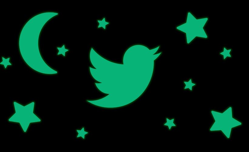
The social media platform is rolling out a new version of Dark Mode, the color palette for its interface designed to relieve your eye strain by replacing the bright white background with a darkened one. A new “dim” setting changes the theme to dark gray, and “lights out” turns the background to true black. Twitter is also rolling out a new way to view the platform in high contrast, aimed at users with low vision.
As a design trend, Dark Mode is having a moment. Our eyes, it seems, have staged an insurrection against the brightness. We want to stare into the abyss without bleaching our brains. We want to tweet at 2 am without the betrayal of a bright screen. Reddit, YouTube, Gmail, and other platforms have each introduced ways to dim the lights, reverting to white text on a black background; WhatsApp and Slack are rumored to be building their own Dark Mode enhancements too.
In fact, a primitive Dark Mode has existed on Twitter since 2016. That earlier incarnation, called Night Mode, turned Twitter’s backdrop steel blue; white text and cobalt links popped against it. For users with low vision, it offered a way to navigate the platform without squinting. For the rest of us, it offered a reprieve from the blistering brightness when we scrolled through our feeds in dim rooms.
Bryan Haggerty, Twitter’s senior design manager, says Night Mode was a blockbuster from the start. But a lot has changed since 2016. Haggerty noticed Twitter’s users toggling it on during the day, or leaving it on all the time. More of Twitter’s users had upgraded to phones with OLED screens, like the iPhone X, which can display a pure black that spares the battery because it’s not emitting any light. So it was time to revisit how the settings worked.
Also, an accessibility audit of Twitter’s existing features found that Night Mode palette could stand to improve its color-contrast ratio for people with low vision. “Giving people this option to decrease the light actually improves readability for people with photosensitivity,” says Liz Ferrall-Nunge, Twitter’s director of user research. “So there were multiple benefits, especially in the case of accessibility.”
Dark Mode Rules, Don’t @ Me
Around the same time, Wall Street Journal columnist Christopher Mims tweeted about the rise of Dark Mode across platforms. “In a world of bright, blue light-spewing LCD screens, every app should have a dark mode,” he wrote, linking to a column by fellow WSJ columnist (and former WIRED writer) David Pierce.
“Wish all apps used black for dark mode,” replied Alex Maxham, an editor for Android Headlines. “Unlike this weird blue @Twitter uses.”
Jack Dorsey, Twitter’s CEO, jumped into the thread. “Was just talking about this with @kayvz,” he tweeted. “Will fix.”
Like everything on Twitter, the discussion of Dark Mode became divisive. Scroll through that thread and you’ll find a variety of opinions. Some users argued that “dark blue is so much better than straight black” and pleaded with Jack to leave Night Mode intact. Others pointed out that on phones with OLED screens, dark blue sucked the battery; true black would keep them on Twitter for longer. Ben Grosser, a new media professor and the creator of Twitter Demetricator, suggested dark gray—a compromise. “I think you are attracted to dark things because your hearts are dark,” tweeted Rebbecca Robertson, an online Christian activist. “Give your life to Jesus He is the light of the world and you will appreciate bright things.”
It was clear that people wanted options—bright, dim, or dark. So Twitter’s design team decided to build the new feature in a way that put choice first.
Haggerty, who’s been at Twitter for nine years, says the company hasn’t always designed this way. Like most platforms, it’s issued new features or design tweaks and then waited to hear feedback from the community. Now, he says, Twitter is trying to listen more critically to its users and proactively build for their needs.
Shine Darkly
Twitter users can find the new darker themes in the Display & Sound setting on Twitter’s app. (For now, they’re only available on iOS; Twitter says it’s building new controls for Android and Twitter desktop soon.) Toggle into Dark Mode and you’ll find two palettes to choose from, Haggerty says. “If you have an LCD screen, you’ll get our standard dark mode which is what we call Dim. If you’ve got an OLED screen, like an iPhone X, you’ll get this more true black version, which we are calling Lights Out,” he says. You can also long press on the Dark Mode icon—before, it was a moon; now it’s a light bulb—for quicker access.
You can also set Dark Mode to change according to the time of day, so that it automatically dims at night and brightens up again in the morning. “It happens around sunset,” says Haggerty. “I’ll be looking at the app, reading Twitter, and all of a sudden it’s like whoosh. It goes into dark mode.”
Twitter hopes the new Dark Mode will make it easier to use the platform in different contexts. It might also encourage you to use Twitter more often, or in places you otherwise wouldn’t—like tweeting late at night or pulling your phone out in a dark bar. When Twitter debuted Night Mode three years ago, it found that people did spend more time scrolling and tapping when they had the feature turned on. “We found that people were coming back to the app more often, and spending more time [on Twitter] as well,” says Kaufman.
So while the new feature may give your eyes a rest, your thumbs will probably continue to work overtime.
More Great WIRED Stories
- DJs of the future don’t spin records—they write code
- The true dollar cost of the anti-vaccine movement
- What it’s like to be thrown in jail for posting on Facebook
- These brainy bikes do everything but ride themselves
- Trump’s casinos couldn’t make Atlantic City great again
- ? Looking for the latest gadgets? Check out our latest buying guides and best deals all year round
- ? Want more? Sign up for our daily newsletter and never miss our latest and greatest stories
Source:WIRED